Manor Academy

Branding, Print

Manor Acdemy Logo Design And Brand Colour Scheme

A fresh look to mark a new era for an innovative

It’s not very often you get to re-brand the school you went to during your earlier years, this was the case when we were commissioned to work on the branding of the Manor Academy in Mansfield Woodhouse. Two members of our team were students at the academy before their university studies commenced which was a great starting block for the project in hand.
Manor Academy Stationery

Readability

Logo Application

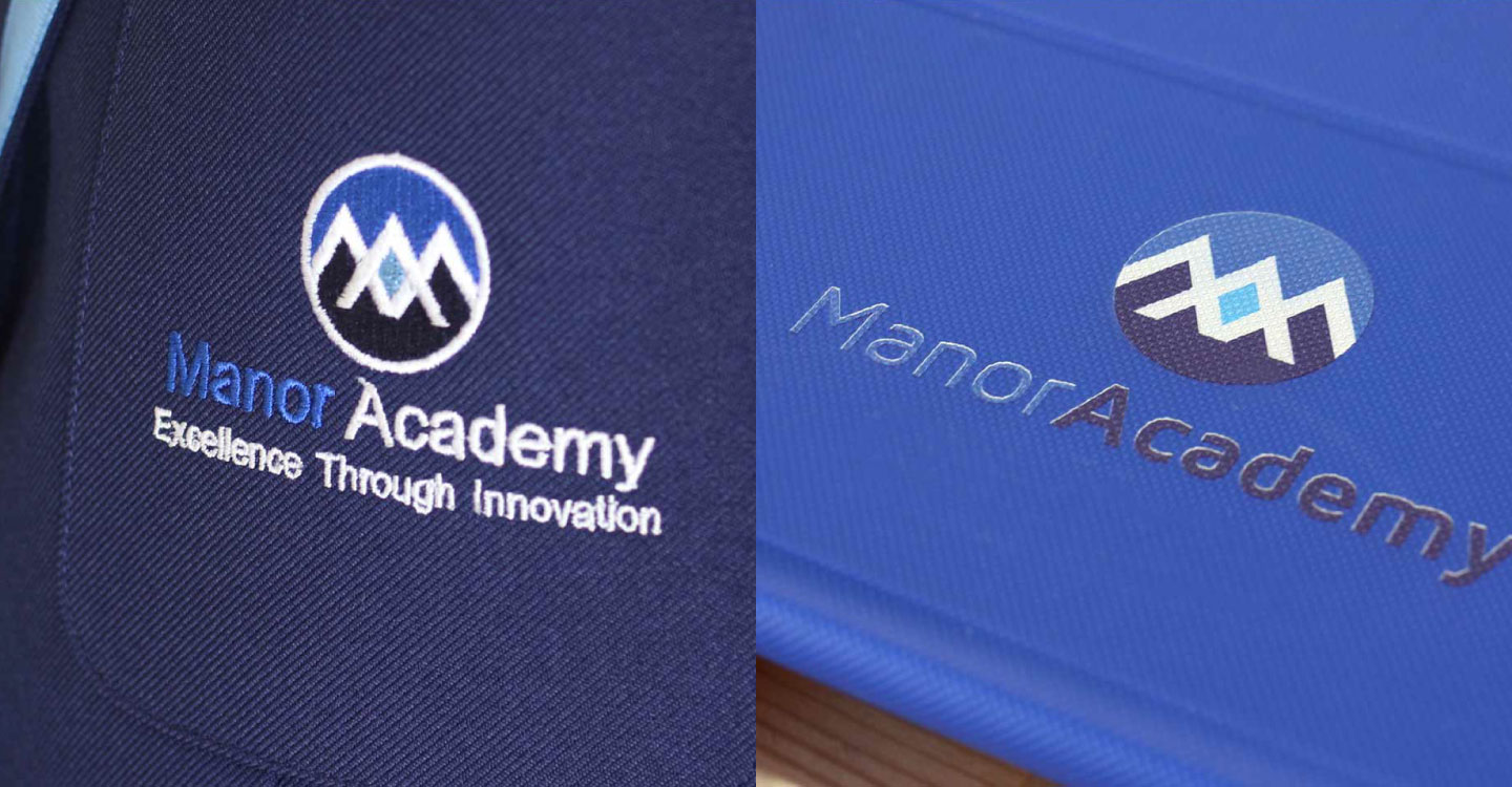
When designing the new branding for The Manor Academy we kept in mind that it would be used across various formats. From school signage, uniforms, vehicle liveries, digital and print we wanted the branding to be easily readable and recognisable. By using simple shapes and a clean typeface we were able to create a logo that stood out when applied to a multitude of designs.

Colours

If It Isn’t Broke

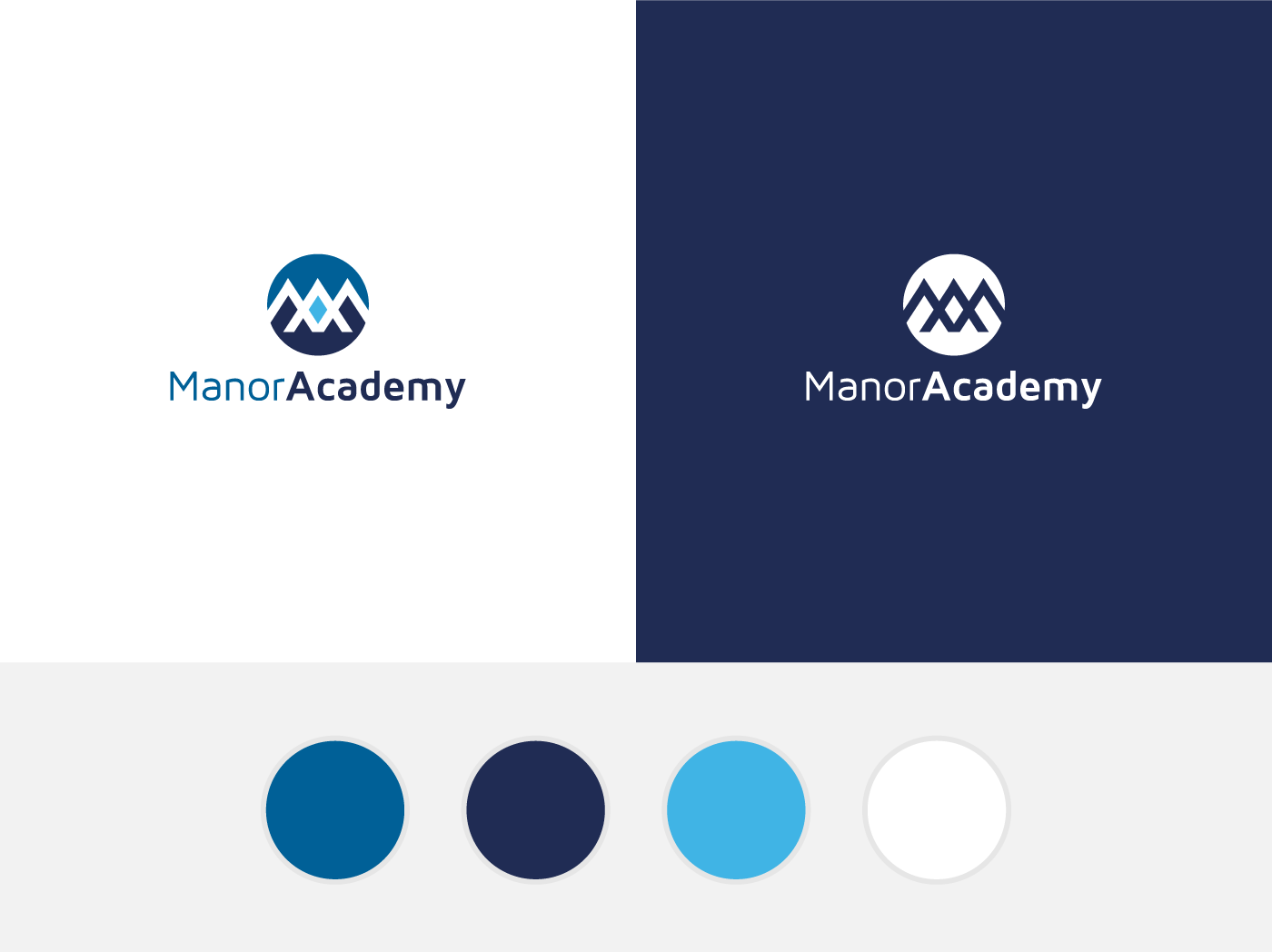
With established colours already in place with their previous branding Manor felt like keeping them would help strengthen the link between the old and new. We took the primary shade of blue from the previous branding but also added some new tones. This meant that the connection to the old branding would still be there while also giving a fresh look to the new branding.

Attention to Detail

Three Peaks

The logo design centres around an interlocking M and A which are not just the Academy’s initials but also make three peaks. These three peaks represent Manor Academy’s core values Aspire, Achieve and Excel.

Manor Academy Logo Application
Ecommerce,
WooCommerce,
Brochures,
Leaflets,
Websites,
WordPress,
Menus,
Logo Design,
Social Media Posts,
Business Cards,
Ecommerce,
WooCommerce,
Brochures,
Leaflets,
Websites,
WordPress,
Menus,
Logo Design,
Social Media Posts,
Business Cards,
Ecommerce,
WooCommerce,
Brochures,
Leaflets,
Websites,
WordPress,
Menus,
Logo Design,
Social Media Posts,
Business Cards,

Let's talk about your next project